


AYM Trading
AYM Trading Ltd ("Automate Your Money") is the parent brand behind The Fibonatti, an automated trading algorithm. I worked on the AYM identity across two distinct phases: first refining the client's existing badge-and-candle concept into a polished mark, then, once The Fibonatti identity was finished, rebuilding AYM from scratch as a pure letterform monogram after the client felt the two brands no longer sat well side by side.
The result is a rare case study in knowing when a "nearly approved" direction is the wrong one to ship.
BRAND IDENTITY, LOGO REFINEMENT, LOGO REDESIGN, CREATIVE DIRECTION, CLIENT MANAGEMENT
WHAT WAS DELIVERED:
-
Vectorised AYM lettering, tagline lockup and badge concepts (phase one)
-
New letterform-only monogram, colour system and file package (phase two, final)
THE BRIEF

AYM's founder had already hand-developed custom lettering for the brand and wanted it professionalised: cleaned up, vectorised, and paired with a badge mark representing finance and the markets. They have sketched a price-candle motif himself but wasn't fully sold on it,
noting in his own brief that "it's not obvious what they represent."
That uncertainty is exactly where the first phase of work began.
Previous AYM logo
(as provided by client)
ORIGINAL DIRECTION
Concept Exploration
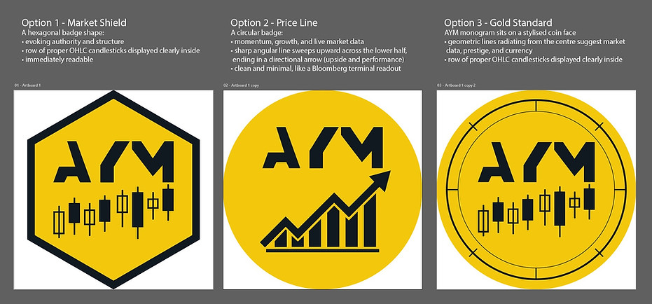
Three badge directions were developed around the existing AYM letterforms: a hexagonal "Market Shield" built for authority and structure, a circular "Price Line" using a sweeping arrow for momentum, and a "Gold Standard" concept that set the letterforms on a coin-faced circle with price candles inside.
Gold Standard, combining the letterform with the circular frame and candle imagery, was the direction that gained the most traction and moved furthest through approval.
concept development, typography vectorisation, client presentation
Refining the Gold Standard
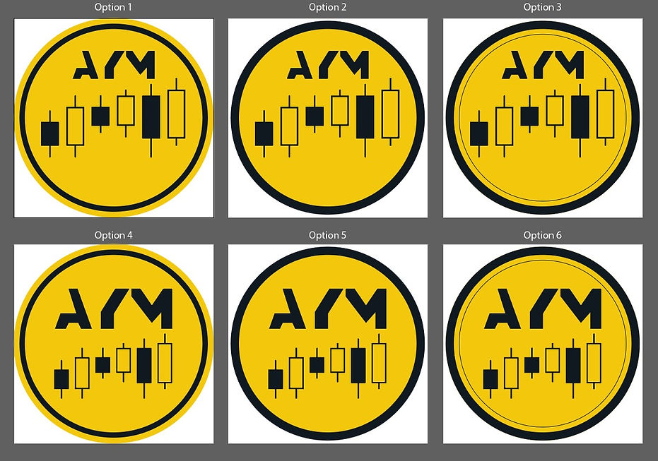
With Gold Standard chosen as the strongest direction, work moved into refining two details: the candlesticks and the ring framing them. Six variations were produced, testing candle proportions and spacing against a single-ring border and a double-ring border, the latter leaning further into the coin-face quality the concept was named for. Option 1, with its tighter candle rhythm and single ring, was the version approved to move forward, right up until it sat next to the finished Fibonatti mark.
refinement, detail iteration, client approval
THE PIVOT

VS

Around the same time, The Fibonatti's brand identity was completed: a refined, symbolic mark built on the Eye of Providence and the Fibonacci spiral. Once the client saw the two identities side by side, the mismatch was immediate. The Fibonatti read as considered and premium; the AYM badge, candles and all, suddenly read as decorative in comparison. Rather than force a connection that wasn't there, the client closed out the badge direction entirely and commissioned a fresh brief for AYM.
NEW DIRECTION
Letterform Exploration
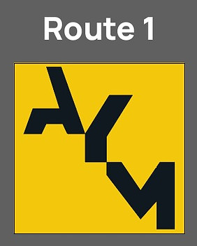
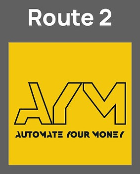

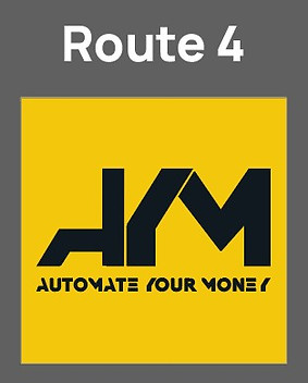

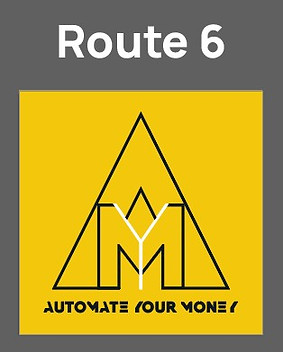
The new brief was clear on what was out: no candles, no badge. What it left open was geometry. Alongside the letterform itself, a pyramid construction echoing The Fibonatti's own was agreed as worth testing rather than ruled out from the start. Six routes were developed across both directions, testing how A, Y and M could interlock and whether the pyramid frame added clarity or just repeated an idea The Fibonatti already owned. The unframed, interlocked letterform won: A and M lean into a shared M, and the Y sits centred between them as a single connecting stroke, tying the three letters into one continuous form rather than three separate marks side by side.
structural exploration, colour calibration, sibling-brand relationship
Final Letterform Mark
The final mark sets A and M in white against a dark ground, with the Y picked out in gold as the one element that breaks from the rest, the same connective role the spiral plays inside The Fibonatti's eye. Colour variations were developed once this construction was locked, giving AYM a small family of applications built on one resolved letterform rather than a set of unrelated alternates.
lockup finalisation, colour variation, file preparation
Colour Variations
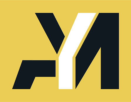

AYM Trading and The Fibonatti now share a visual language built on precision and restraint,
one expressed through symbolism, the other through pure letterform.
More too See
Locked and loaded, the Fireaway x Call of Duty: Black Ops 7 campaign fused bold flavour with high-impact gaming energy, turning everyday touchpoints into an immersive brand experience designed to capture attention and engage fans.
creative direction, visual strategy, asset production
Fireaway x Call of Duty

Fireaway Christmas Box 23
A collaborative holiday campaign led by me, working with an illustrator to bring the concept to life. The interactive pizza box encouraged customers to color, share, and engage with the brand — blending playful design with social media strategy.
concept, art direction, editing, project management

Fireaway - Fresh & Crave-worthy
A delicious mission at Fireaway Pizza transformed bland product photos into drool-worthy digital temptations. Think gooey cheese, golden crusts, and saucy close-ups. Pizzas got their glow-up, and the internet got hungry.
art direction, visual strategy, food styling
