


The Fibonatti
Building a brand identity from the ground up for The Fibonatti, an automated trading algorithm under AYM Trading Ltd, I led the process from initial concept through to a finished brand system, working closely with the client at every stage.
The identity had to earn trust without a storefront, a sales team, or a track record to lean on. Every decision, from the symbol to the colour palette, was made to signal precision and confidence at first glance.
BRAND IDENTITY, LOGO DESIGN, CREATIVE DIRECTION, CLIENT MANAGEMENT, VISUAL SYSTEM DEVELOPMENT
WHAT WAS DELIVERED:
-
Logo concept development and final mark
-
Primary mark (for compact use)
-
Expanded lockup (for large-format use)
-
Colour and typography system
-
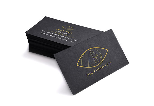
Stationery and brand collateral
THE BRIEF
AYM Trading approached Crisp Studio to develop a brand identity for The Fibonatti, an automated trading algorithm due to launch under their parent company. The concept was set from the outset: fuse the Eye of Providence with the Fibonacci Golden Spiral, two symbols that carry real weight for a financial audience rather than decorative flourish. The Eye of Providence signals oversight and authority, apt for an algorithm making autonomous decisions on someone else's behalf. The Fibonacci spiral is not just a nod to the name; Fibonacci retracement is a genuine technical analysis tool traders use to read the market, so the mark encodes the product's actual method into its symbolism. The brief called for something that read as institutional, elite, mathematical, and quietly "enlightened", built to work in dark mode as well as light.
LOGO DEVELOPMENT
Concept Exploration

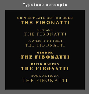
Early development tested how far the name could carry the identity on its own, trialing typeface pairings including Copperplate Gothic Bold, Centaur and Book Antiqua alongside symbol concepts that referenced the Fibonacci sequence more or less literally. Each direction went to the client for review, narrowing toward a mark that felt precise without reading as cold.
concept development, typography exploration, client presentation

Primary Mark
Colour Variations
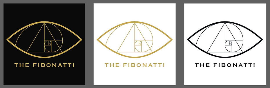
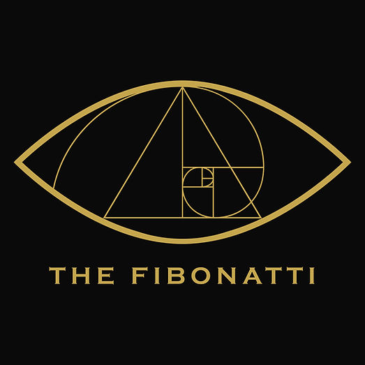
The final identity resolves the brief's two references into one mark: an almond-shaped eye standing in for the Eye of Providence, with a golden ratio spiral construction built into its centre where the iris would sit. Rather than illustrating both ideas side by side, the spiral becomes the eye's pupil, so the mathematics and the symbolism read as a single form.
Expanded Lockup

Colour Variations

The primary mark works at small sizes by keeping just the eye and the spiral. The expanded version completes the reference in full: the eye sits inside a triangle, restoring the pyramid the Eye of Providence traditionally appears above, with the wordmark set along its base. A hexagon frames the whole construction, giving the mark a contained, faceted shape suited to large-format use, where the primary mark alone would feel too small a gesture: presentation covers, signage, certificates, anywhere the identity needs to hold a space on its own rather than sit alongside other content.
concept development, lockup construction, format-specific application
COLOUR & TYPE SYSTEMS

Black and gold were chosen partly to connect The Fibonatti visually to AYM Trading, its parent company, whose own identity Crisp Studio also developed. The shades used aren't identical across the two, though. Small deviations in the black and gold values keep The Fibonatti recognisably part of the same family without reading as a copy of the parent brand, and set it apart from the sea of blue-and-grey identities the trading sector defaults to. The system was documented across both colourways so the mark applies consistently wherever it's needed.
colour system, brand relationship, typeface pairing
Six typeface directions were tested against the wordmark before landing on Copperplate Gothic Bold. Centaur, Footlight MT Light and Book Antiqua all read too soft and editorial for a financial product; Glodok and Ratio Modern read closer to generic branding than something built for this specific mark. Copperplate Gothic Bold carries the stamped, engraved quality of an official seal or currency plate, which reinforces the Eye of Providence reference rather than sitting apart from it. Its small caps and even weight also hold up cleanly at the small sizes the primary mark needs to work at.
typeface selection, comparative testing
The Fibonatti is currently in development ahead of launch.
Full brand guidelines and applied assets available on request.
APPLIED ASSETS

More too See
Locked and loaded, the Fireaway x Call of Duty: Black Ops 7 campaign fused bold flavour with high-impact gaming energy, turning everyday touchpoints into an immersive brand experience designed to capture attention and engage fans.
creative direction, visual strategy, asset production
Fireaway x Call of Duty

Fireaway Christmas Box 23
A collaborative holiday campaign led by me, working with an illustrator to bring the concept to life. The interactive pizza box encouraged customers to color, share, and engage with the brand — blending playful design with social media strategy.
concept, art direction, editing, project management

Fireaway - Fresh & Crave-worthy
A delicious mission at Fireaway Pizza transformed bland product photos into drool-worthy digital temptations. Think gooey cheese, golden crusts, and saucy close-ups. Pizzas got their glow-up, and the internet got hungry.
art direction, visual strategy, food styling
