

.jpg)
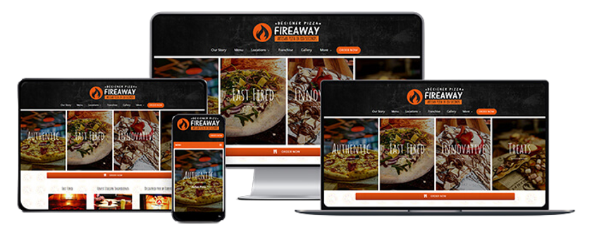
Fireaway - New App & Website
I contributed to the development of the Fireaway app and website by shaping their visual direction and ensuring a consistent, on-brand user experience across both platforms. Working closely with an external development partner, I provided guidance across UX and UI, helping translate the Fireaway identity into cohesive digital products.
I created and delivered key visual assets including product imagery, promotional graphics, and UI elements, while coordinating with marketing and product teams to ensure accurate and effective menu implementation. I also oversaw the internal design team in building a comprehensive asset library, supporting a scalable and unified digital experience.
CREATIVE DIRECTION, UX/UI STRATEGY, DIGITAL PRODUCT DESIGN, BRAND IMPLEMENTATION, TEAM LEADERSHIP, CROSS-FUNCTIONAL COLLABORATION, DEVELOPER PARTNERSHIP
WHERE IT WAS FEATURED:
-
Fireaway App
-
Fireaway Website
THE BRIEF
The brief called for the development of Fireaway’s app and website, with a focus on creating a cohesive and intuitive digital experience that enhanced the overall customer journey. The goal was to translate Fireaway’s visual language into UX and UI, improving usability and engagement while delivering a complete set of assets and imagery to support seamless menu integration, promotional activity, and ongoing marketing across both platforms.
WEBSITE DEVELOPMENT & RESULT
Before
The previous Fireaway website presented a bold and energetic visual style, with strong use of dark tones and vibrant food imagery that aligned well with the brand’s identity and helped communicate a sense of authenticity and flavour. However, the layout felt visually crowded and lacked clear hierarchy, making navigation and key actions less intuitive for users. The experience would benefit from improved structure, simplified navigation, and more consistent imagery to create a smoother, more engaging customer journey, particularly across mobile and ordering touchpoints.
After
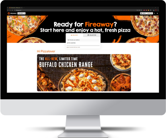
The new Fireaway website introduces a more refined and user-focused experience, evolving the brand while maintaining its bold and recognisable identity. The visual approach has been streamlined, with cleaner layouts, improved spacing, and a clearer hierarchy that makes navigation more intuitive and product discovery easier. Menu items are presented in a more structured and consistent way, allowing customers to quickly browse, customise, and make decisions with confidence.
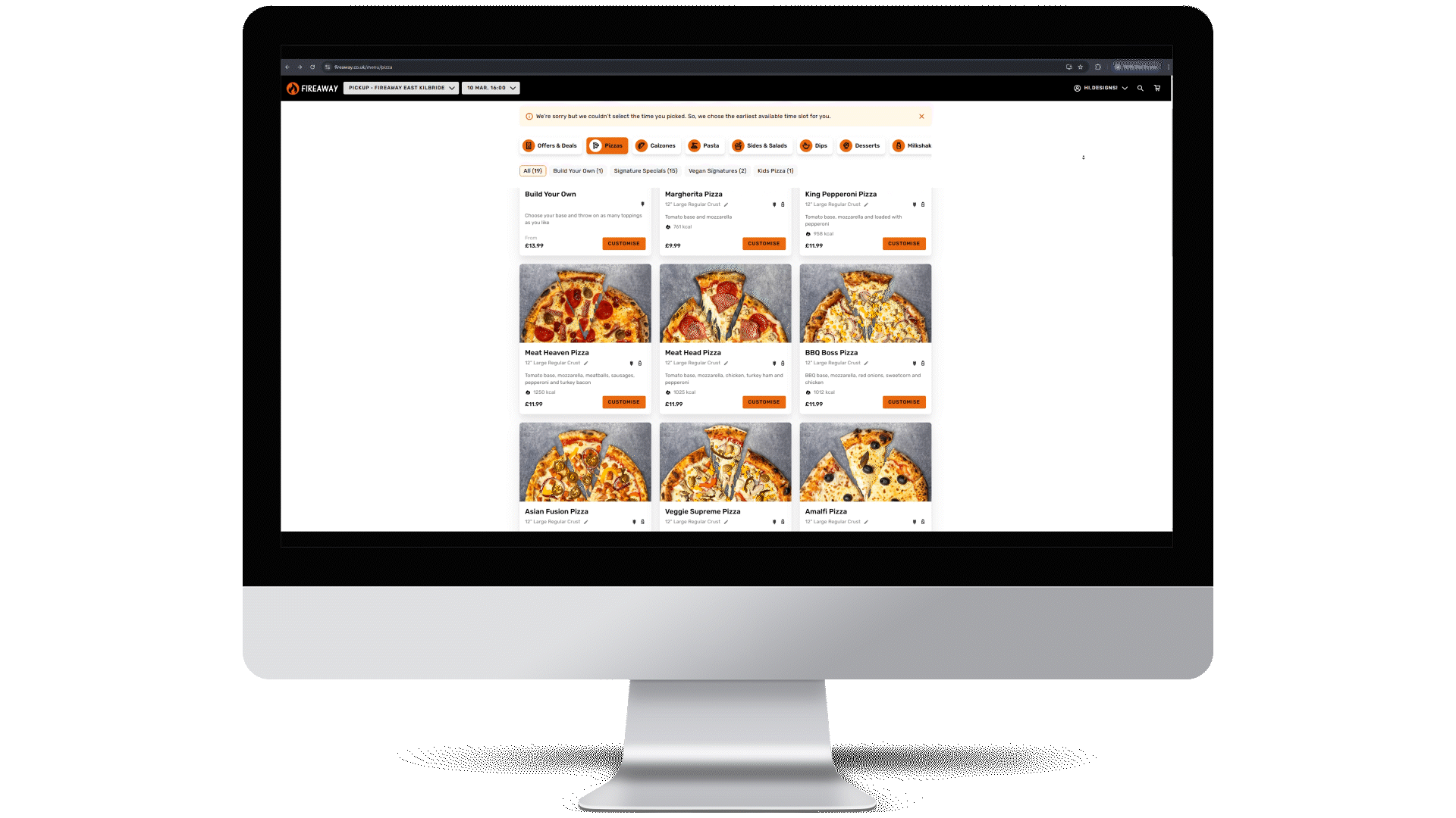
This shift in direction was driven by the need to enhance the overall customer journey, particularly across digital ordering touchpoints. By simplifying the interface and standardising imagery and components, the new design reduces friction and improves usability across devices. The result is a more modern, scalable platform that better supports Fireaway’s growth while delivering a faster, more engaging experience for customers.


Image formats have also been optimised and standardised, streamlining asset preparation and improving the efficiency and consistency of photoshoots.

The Loyalty System, now Fireaway Flame Club has also been reworked to provide a more user-friendly and accessible experience. The structure has been simplified, making it easier for customers to understand the benefits and engage with the programme, while clearly communicating available rewards and perks. With a more intuitive layout and improved integration across the website and app, the Fireaway Flame Club now feels like a seamless part of the overall journey, encouraging repeat visits and strengthening customer loyalty.
APP DEVELOPMENT & RESULT